We may not judge a book by its cover, but we almost always judge a company by its website. Over time, we have come across some really bad website designs that have made us question our aesthetic taste. While some have made us laugh, others have left us completely frustrated!
Poor website design doesn’t always mean flashy colors and terrible graphics. Even something as simple as confusing or inconvenient navigation can be enough to turn us off the page in an instant.
Here is a compilation of the 25 worst websites of 2026 that will shock you and make you wonder how they ever survived! This collection of the worst designs shows us which mistakes we should avoid at all costs.
Key Takeaways
- A bad website drives visitors away: A bad website confuses, frustrates, or loses interest in visitors – and drives them away before they even know about your business.
- Clutter hurts your business: Cluttered pages, confusing menus, and outdated designs drive users away quickly, increasing your bounce rate and hurting your business.
- Speed is critical: A slow website drives people away quickly – nearly half of users abandon a page that takes more than two seconds to load.
- Mobile optimization is essential: A website that doesn’t work well on mobile phones misses out on a huge number of visitors, as most people today browse the web on their phones.
- Poor design undermines trust: Users judge a company based on how its website looks, just as they judge a product based on how it looks on the shelf.
- Errors cost you customers: Spelling errors, outdated content, and missing product details cause visitors to lose trust in your brand and choose a competitor instead.
- Design impacts SEO: Bad website design also hurts your SEO, as Google prefers streamlined, fast, and mobile-friendly websites that users enjoy visiting.
- Even big brands struggle: Real-life examples like Ling’s Cars, Arngren, and Berkshire Hathaway show that even existing businesses struggle with bad design that confuses visitors.
- Fixing vs. rebuilding: It takes about 4 to 8 weeks to properly fix a website, but if the problems are severe, building a completely new website often saves more time and money.
- First impressions count: First impressions are made in seconds – a clean, fast, easy-to-use, and beautiful website keeps visitors engaged and converts them into customers.
What Makes a Website Bad?
A bad website is one that doesn’t meet users’ expectations, makes navigation difficult, or provides a poor experience. These websites have poor design choices, such as slow loading, layouts that don’t work well on all devices, cluttered pages, and branding that doesn’t match.
What makes a bad website design?
Many things can make a website design bad.
Cluttered and confusing look and layout
Outdated design makes a site look neglected and unsafe to trust. A cluttered page with too many things can confuse people. If the menu is hard to understand, even smart users will get annoyed. A good design should be clean, fresh, and look good. Since 61% of users leave if they don’t find what they’re looking for within 5 seconds (Forbes Advisor), this is what you should focus on.
Slow loading
47% of people leave if a site takes more than 2 seconds to load (Sweer). Slow loading is bad design. This is often caused by bad hosting or large images and files that don’t reduce in size. This problem can drive people away and put your site on the “worst websites” list.
Poor UX and lack of accessibility
Too many pop-ups, ads, long forms, or a mix of colors, fonts, and buttons can hurt a user’s time on a site. If a site doesn’t follow easy-access rules, it can deter many people from using it. This includes no alternative text for images or no support for screen readers.
Irrelevant, poorly written content
Outdated, off-topic, or poorly written text weakens a site. Spelling and grammar errors also damage trust.
Not mobile-friendly
Today, every site works well on a phone. Google also ranks mobile-friendly sites better. It’s easier to make your site fit on all screens. Small Business Trends says that 74% of people return to a site that works well on their phone.
Read More: Direct Traffic in Google Analytics: What It Means & How to Measure It
Now, here’s the complete list of 25 bad websites:
1. The Big Ugly Website
Website: https://thebiguglywebsite.com/
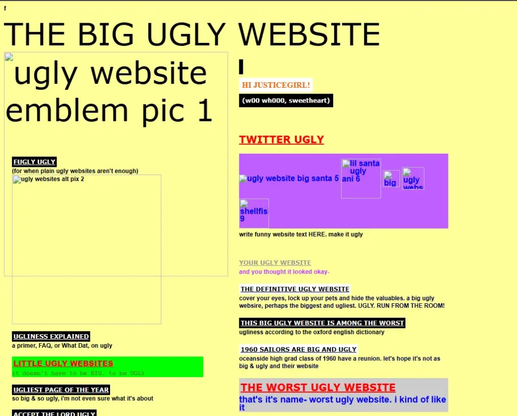
I don’t quite understand the purpose of The Big Ugly website, but it really does look like a website that shows how a bad site works. The page looks messy and confusing. When you click on the links, the experience gets worse.
This website only has one page and it’s not designed properly. The colors don’t match and it makes the page look weird. This site also doesn’t work well on mobile phones because it doesn’t show the proper mobile layout.
There’s also a small “f” icon in the top left corner, but it doesn’t work when you click on it. This makes the website look incomplete and poorly designed.
2. Pacific Northwest X-Ray Inc.
Website: https://www.pnwx.com/
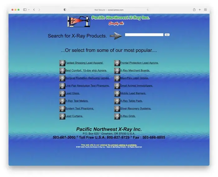
This website feels very low-quality and confusing. It’s hard to understand what the company actually does, and nothing on the page makes you want to explore further.
The design feels very dated and outdated. Because of this, most visitors may choose to quickly leave rather than search or click on anything.
3. Windows 93
Website: https://windows93.net/
Windows 93 is a fun website that looks like an old computer system. It shows a fake version of Windows that never really existed. When you open it in your browser, you see a retro desktop with pixelated icons, a Start menu, and movable windows.
The screen looks intentionally cluttered. You see bright colors, strange error messages, and old CRT-style graphics. The desktop also has a lot of weird applications, like a cat piano and funny file tools.
Even though it looks weird, it works smoothly inside the browser. Windows 93 shows that ugly design can be creative and even fun. It will make people laugh while reminding them of old computers from the 1990s.
4. Ling’s Cars
Website: https://www.lingscars.com/
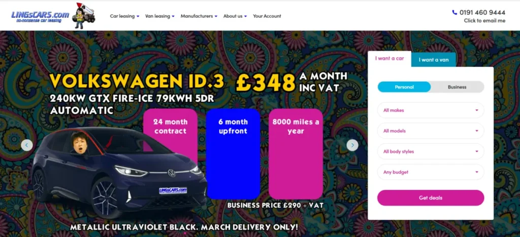
The website for Ling’s Cars looks very flashy and busy. Too many colors, animations, and moving objects make the page confusing. It becomes difficult to know where to look first. Some Asian websites use this style, but it is still distracting.
The layout also does not adjust well on mobile phones. Because of this, users have difficulty finding information or products easily.
There is also a video on the page, but the heavy animation hides it. Most people will not even notice it. The page would look much cleaner and easier to use without all these effects.
5. PETERS BUSS AB
Website: https://wordpress.petersbuss.se/
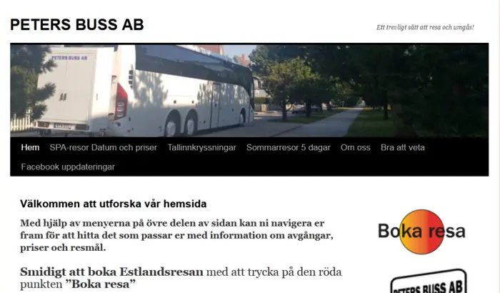
Is it a cruise? Is it a spa? What exactly is it they are selling? Their customers could have spent a minute or two guessing the product had they only put decipherable words. Keeping that aside, who opts for a lime and tangerine combo over a turquoise background? But despite that, feel free to call them and check, at least that has been clearly displayed, in-your-face.
6. MIT Center for Advanced Visual Studies
Website: https://act.mit.edu/

It’s impossible to expect a bad website from one of the world’s top academic institutions, but this institution has made it to the list of worst websites twice. MIT’s Center for Advanced Visual Studies looks good at first glance, but it’s hard to find. It doesn’t have a clear menu bar, and the layout isn’t traditional. Many visitors get lost, trying to figure out where to find the details they want. Clumsy scrolling is more annoying than creative.
7. Alpha1teclabs
Website: https://www.alpha1teclabs.com/

What were they thinking? Their changing mindset is evident from the name of this website. The further down the page you scroll, the more their confusing style becomes apparent. Take their color choices, for example. It’s as if someone said – “Dude, let’s go VIBGYOR,” and without thinking for themselves, the website creator just followed suit.
8. Historian Of The Future
Website: https://www.historianofthefuturex.com/
While the name may remind you of old historical films, from Braveheart to One Name, the site is confusing. And no historian of any time can say why they left the right side blank and covered it with black paint.
9. Blinkee
Website: https://blinkee.com/
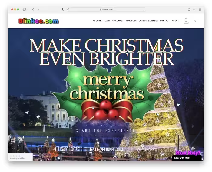
Even though the name may remind you of old historical films, from Braveheart to One Name, this site is confusing. And no historian of any time can say why they left the right side blank and covered it with black paint.
10. 007 Museum
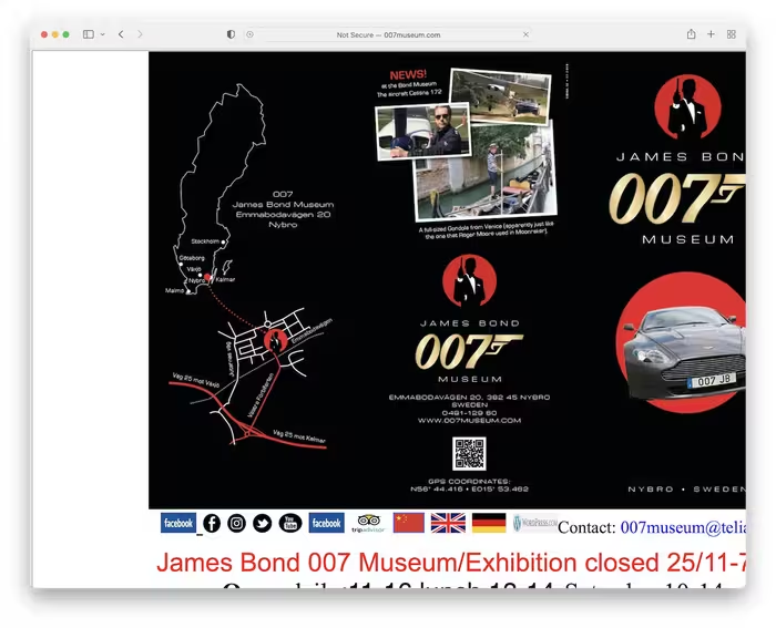
I think James Bond should have a much better website than the 007 Museum. This is a clear example of a bad website and shows a lot of things you shouldn’t do.
The site doesn’t adapt to the screen size and takes a long time to load. The strange fonts, the messy layout and the very long landing page make the visit unpleasant.
Like the Toronto Cupcakes, the 007 Museum could be more fun and more exciting.
11. Lipton
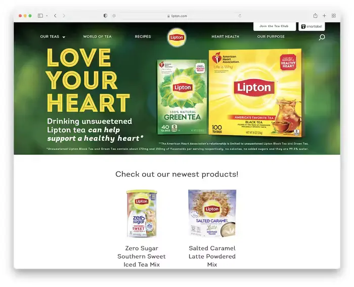
Lipton is a huge brand, yet its website doesn’t give it that feeling. The low-quality product shots and generic stock photos need to be retaken or replaced, as they create a bad image for the brand.
The site itself isn’t terrible, but it clearly shows that even global giants can lose their powerful online presence.
There’s always room for improvement.
12. Toronto Cupcake
Website: https://www.torontocupcake.com/
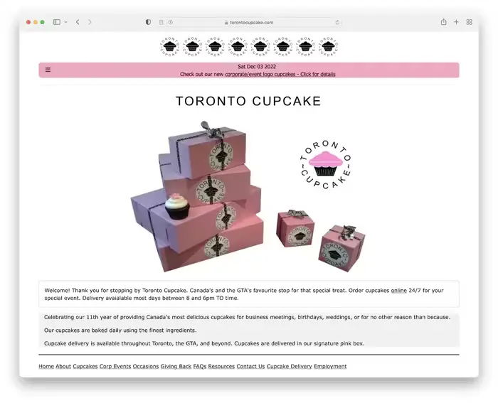
While food pictures often make a dish look better than it actually is, I don’t think that’s true for Toronto Cupcakes. And that’s one reason why this is a bad website example.
The site design feels dated (and not in a good way) with a very simple product page and cart. It’s not engaging; instead, it turns people away when it could be fun and engaging.
13. Drudge Report
Website: https://www.drudgereport.com/
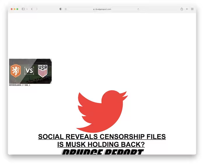
The Drudge Report has been online for many years, and even though it often adds new stories, its appearance still looks the same as it did the year it first went live.
It’s a clear example of a bad website, with no easy navigation and a hard-to-find search bar.
In short, if you don’t know what the Drudge Report is, it’s hard to find anything – and the small text size makes it even harder.
Further Reading: Instagram vs. Facebook vs. Twitter vs. Snapchat: Which One Is Better for Marketing?
14. Santa Pod Raceway
Website: https://santapod.co.uk/
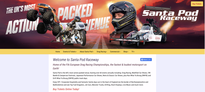
Why this website doesn’t work: The Santa Pod Raceway website for the Springspeed Nationals looks dated and lacks a new, modern style. This makes it less pleasant to look at. Navigation is difficult to follow, important details are not easy to find, and some links go to the wrong pages or no longer work. The site also lacks features to help people with disabilities use it easily. Slow loading times and poor mobile display add to the problem, making it frustrating for visitors. Together, these issues create a poor and undesirable online experience.
15. Ash End House Children’s Farm
Website: https://ashendchildrensfarm.co.uk/
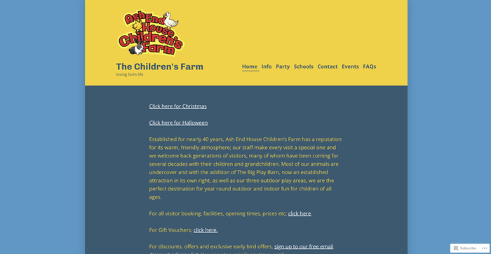
The Ash and House Children’s Farm website design is outdated and busy, which hurts the user experience. Navigation is not clear, making it difficult for visitors to quickly find important details. It also doesn’t work well on mobile, making browsing on phones and tablets frustrating. Fonts and colors are not used consistently, making the site feel cluttered and difficult to use. All of these issues prevent the website from properly engaging and informing its visitors.
16. The Property Investors Network
Website: https://propertyinvestorsnetwork.co.uk/
The Property Investors Network website has an outdated and cluttered design, which makes it feel cluttered and difficult to use. The navigation isn’t clear or organized, so visitors may have trouble finding the details they need. The layout also doesn’t work well on mobile devices, making it a poor experience for people using phones or tablets. Additionally, the font and color scheme don’t match, making the site feel less professional and less user-friendly. These issues can distract visitors from the content, which is why it’s on our list of the worst websites.
17. Discount Beds Belfast
Website: https://www.discountbedsbelfast.co.uk/
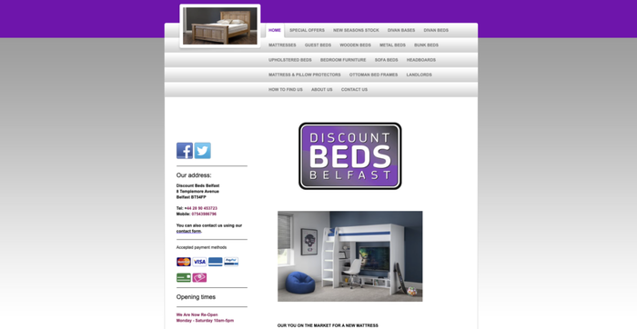
Discount Beds Belfast’s website has an outdated design that doesn’t look good or professional. The layout is cluttered and not well-organized, making it difficult for people to find details or view products. It also doesn’t work well on mobile, making it a poor experience for people using phones or tablets. The mix of different fonts and colors, along with no clear buttons to guide users, makes it difficult to use and less interesting for visitors. All of these issues add up to a poor experience that can turn customers away. Overall, its website design is poor.
18. Real Ultimate Power
Website: https://realultimatepower.net/
Real Ultimate Power is a popular website from the early 2000s. Many people refer to it as “The Official Ninja Webpage.” The site has made millions of people laugh because it talks about ninjas in a funny and exaggerated way. It says that ninjas are “totally awesome” and powerful.
The page looks very simple. It uses Times New Roman text on a plain white background. The headings appear in all caps, and random pictures appear in between the text. The design feels messy and unplanned.
This website breaks many design rules. Fonts change, some words appear in bold for no apparent reason, and images look like basic clip art. The navigation is also confusing and simple.
But that’s what makes the site special. In the early days of the internet, people built websites just for fun. They weren’t concerned with perfect design or strict rules. They just wanted to share their ideas and creativity.
Websites like Real Ultimate Power show how the early internet worked. People created pages with enthusiasm and freedom. They expressed their ideas in their own style without limits. This raw and playful spirit is something that many modern websites today do not show.
19. Animations
Unless you have a clear reason to use animations on your website, it’s best to avoid them altogether.
Here’s an example of a site where the background is filled with dynamic design. It feels like the background is more important than the content – it grabs all your attention.
If you do use animations, have one key element on the page that stands out. You can use it to show who you are and share your details in an easy way.
On the 3Dev site, Weblium has used bold images with bright dynamic text that quickly tells you everything about the company.
20. Penny Juice
Website: https://penny-juice.com/
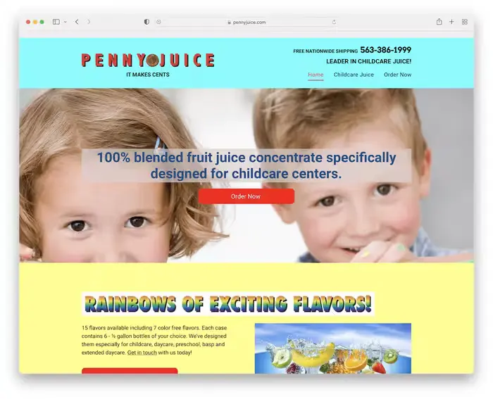
Penny Juice shows how ugly and unprofessional a website can look. If you hadn’t seen the name, you probably wouldn’t even know what the business sells.
From the header to the footer, it needs a lot of design fixes. The images look like stock photos, which isn’t a good option, and the mobile view doesn’t work well – everything just looks bad.
21. Gotham Garage
Website: https://www.gothamgarage.com/
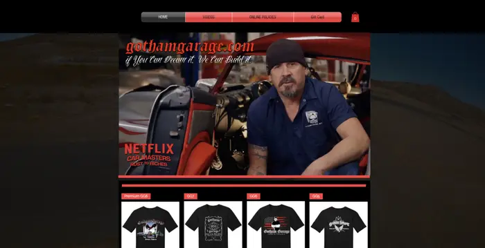
Gotham Garage’s website has several issues that hurt its quality and user experience. First, the design feels dated and lacks a consistent style, making it look less professional and less appealing. Navigation isn’t easy to use, and the layout feels cluttered and hard to follow, which can be frustrating for visitors looking for specific details. It also doesn’t seem well-built for mobile use, which creates a poor experience for people browsing on phones or tablets. The content is also too short and doesn’t provide enough useful details about the services or projects. All of these issues add up to a poor user experience that doesn’t showcase the brand’s expertise well or make it appealing to new customers.
22. Internet Archive Wayback Machine
Website: https://web.archive.org/
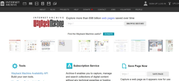
The Wayback Machine is a helpful website that helps millions of people find information that has been removed or saved in archives. But the website design feels busy and is difficult to use. There isn’t enough white space, there are too many items in the header bar, and it doesn’t have a main image to immediately grab attention. The homepage also doesn’t explain much about what the site does. A simple, clear design with a modern style could make it better and easier to use.
23. Berkshire Hathaway
Website: https://www.berkshirehathaway.com/
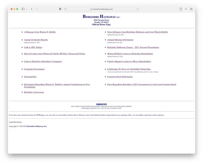
Berkshire Hathaway’s website looks like a simple list with a simple design, no pictures, just links.
The site only helps people who already know what they want and are familiar with Berkshire Hathaway.
Surprisingly, it works well on the phone, but it’s still difficult to find what you’re looking for.
Berkshire Hathaway is different. For example, it could reach a market value of $1 trillion (yes, trillion) without a good website.
24. Arngren
Website: https://arngren.net/
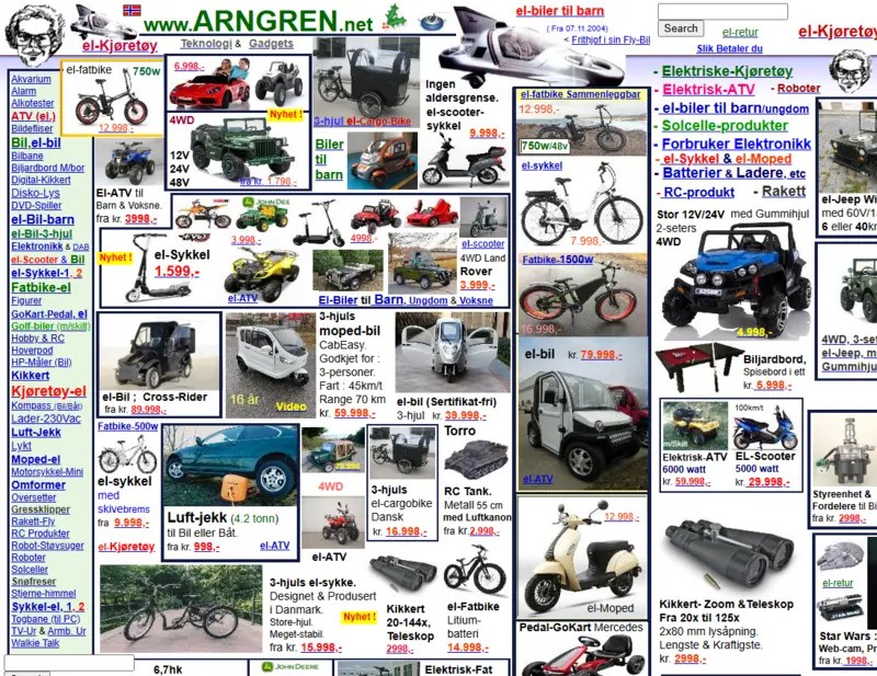
Are we looking at an old phone book or a real website? Arngren shows a poor example of web design because it doesn’t care about the user experience.
The page shows too many images and too little text. The layout doesn’t adjust when someone opens it on a mobile phone. On a desktop screen, people have to scroll left and right unless they’re using a very large monitor.
If someone wants to scan the page quickly, it becomes very difficult. The cluttered design makes it confusing and difficult to read.
25. Cyberdsignclan

‘Skip the intro’ is a risk you really want to take if you want to see what the 50th worst website in the world looks like. In two words – it’s a mess.
Other than that, this site loves the left-hand layout, or maybe that’s the only style they use. And yes, they even give you the option to download their website as a ‘Microsoft PowerPoint’. Only try it if you dare.
Next Read: What Is Technical SEO? Basics & Best Practices (A Guide for 2026)
How do bad websites hurt your business?
website looks unprofessional and makes people lose trust in your business.
Here are some of the main points on how a bad website can prevent your business from growing—
You can lose trust
Bad layouts, strange fonts, and mismatched colors can weaken your brand. It’s like food – would you eat something that looks bad? No. That’s why you should spend money on a good design for your site. You can check examples like Toronto Cupcakes or Penny Juice to see if the design is working well.
Bounce rate increases
If people can’t find the search bar or the menu is confusing, they’ll leave quickly, increasing the bounce rate. Slow websites also push visitors away. Your site should load quickly and provide people with clear guidance on what they need.
Fewer sales and leads
People don’t buy from websites without complete contact details. Always include clear company information. A one-page website can work, but if it has a dark background and no space between the text, it’s hard to read.
Bad design reduces SEO
Search engines prefer clean, well-organized websites with consistent font styles and sizes. Poor design gets less traffic and is less visible online. Websites with poor layouts almost never rank well, even on sites like Hacker News or the Daily Mail.
First impressions matter
Small fonts, large, ugly images, or outdated designs can ruin first impressions. You can check the Internet Archive Wayback Machine for examples like Pacific Northwest X-Ray or Exmouth View Hotel to see what to avoid.
FAQs: People Also Ask
A website is considered bad when it’s difficult to use and slow to load. It can also look outdated and cluttered.
Things like too many items on a page, hard-to-understand menus, and a site that doesn’t work well on phones can be frustrating for users. Content issues like missing page descriptions and using the wrong keywords can also make a design look bad.
Bad design confuses and annoys visitors. When menus are unclear or pages look cluttered, people can’t easily find what they’re looking for.
If a website loads slowly, many users will abandon it quickly. When a site doesn’t adapt to mobile screens, phone users may stop using it. All of these issues reduce user happiness and trust.
Yes, poor design can hurt SEO a lot. Poorly designed websites often have poor content, poor keywords, and poor link structure.
Important tags may be missing or used incorrectly, and slow speeds reduce search rankings. When users don’t like a website, search engines also see it as low quality and rank it lower.
Most websites take about 4 to 8 weeks to properly fix. The exact time depends on how many issues the site has. Major fixes like slow loading speeds and mobile-friendly design usually take about 2 to 3 weeks.
First, check how serious the problems are. If a website has design, speed, and feature issues, building a new website often works better. A complete redesign can save you money and time compared to fixing many small issues one by one.
You can verify this with website data. If the bounce rate is over 70%, visitors are leaving too quickly. If the average time on site is less than 1 minute, people are not staying long. Low sales or sign-ups can also indicate a problem. Tools like Google Analytics help you see these numbers easily.
Continue Reading: How To Get 100K Views on Instagram Reels In 2026: Powerful Strategies That Actually Work